OutboundEngine
The data was there. The agent just needed to see the name.
- Project Type
- Marketing Automation
- Year
- 2020–2021
- Role
- UX Designer & Researcher
- Deliverables
- Research, Mobile, Web, Email
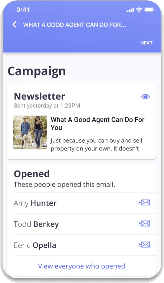 Final prototype — "Opened" screen
A 1.5% click rate looked like failure. It wasn't.
OutboundEngine automated the send. Agents still had to believe it was working. The campaign screen made ordinary results look like rejection — and agents were canceling during dips that sat inside a normal range.
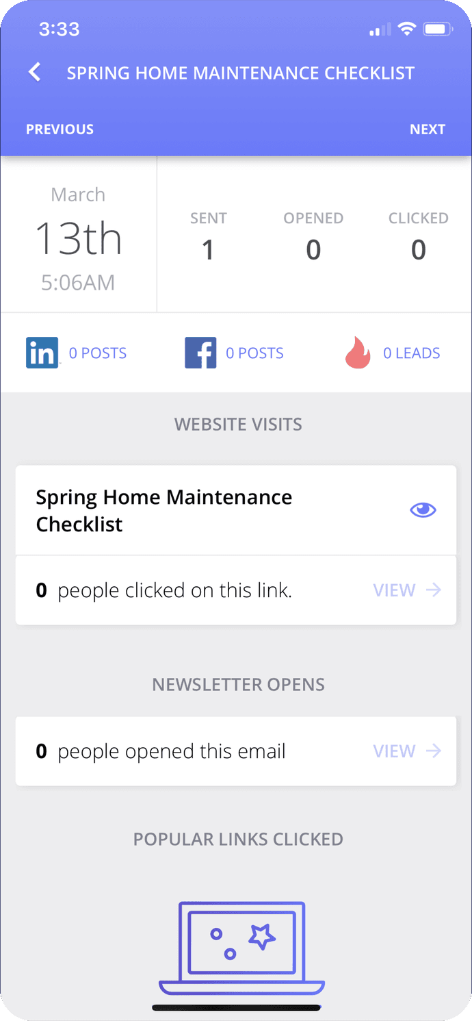
A churned customer said the quiet part out loud. The rate wasn't the evidence they thought it was.
“I saw a 1.5% click rate... in my head, I thought a click rate should convert to business.”
Churned customer
The dips agents quit over were the platform's own normal.
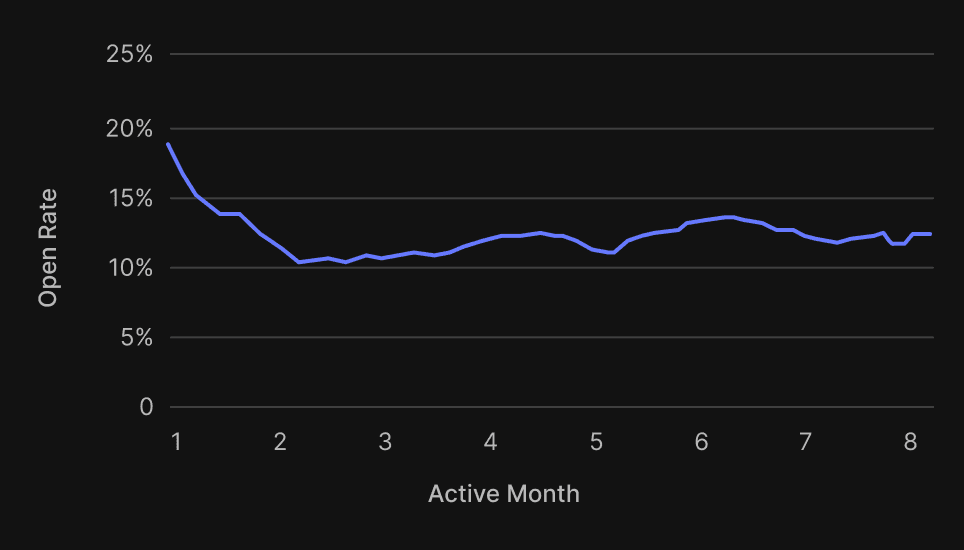
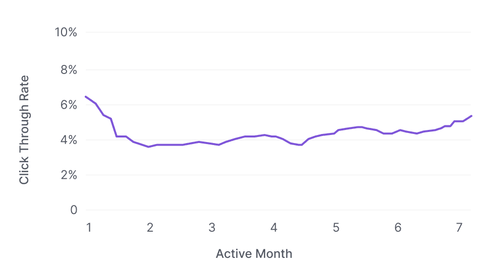
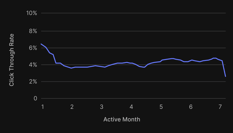
Open rate settles near 12% after a customer's second active month. Click-through settles near 4%. Month one runs high on a fresh list, so every month after it reads as decline — measured against a launch number that was never the baseline.
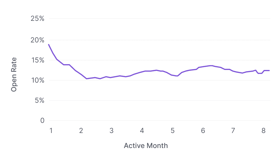
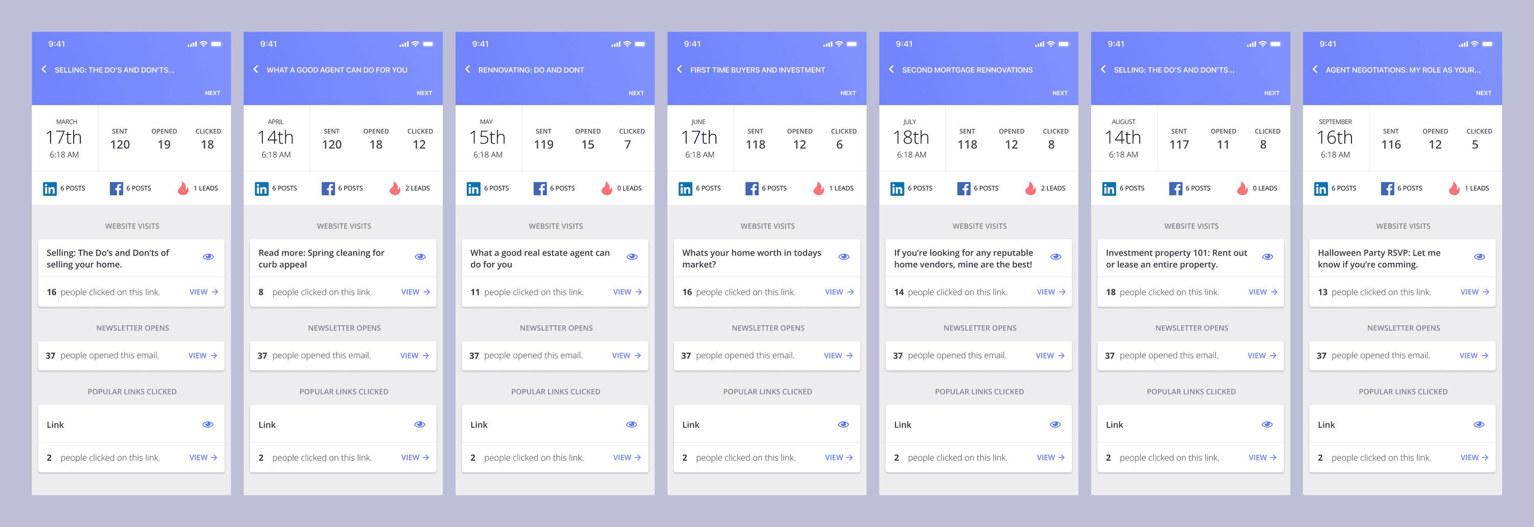
March to September, one screen per send: 18 clicks, then 12, 7, 6, 8, 8, 5. The list barely moved. Every screen still opens on the number that moved least.
Thirteen customers, two screens, one question.
We recruited from NPS promoters with 16+ months tenure, showed each both screens — identical campaign results, different display — and asked them to rate satisfaction and explain their choice.
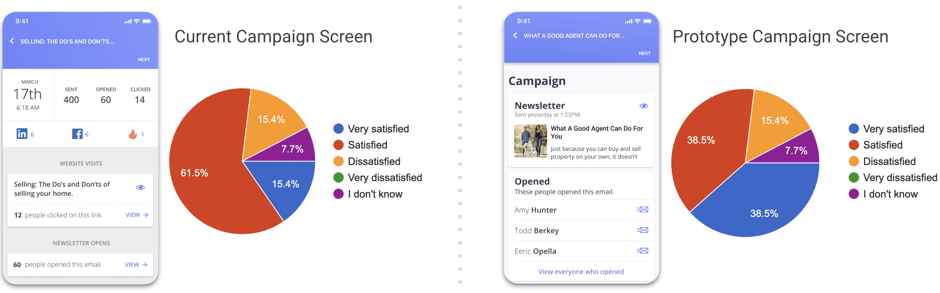
Identical campaign results either side. Sent 400 / Opened 60 / Clicked 14 on the left; the same send, named, on the right.
Very satisfied moved from 15.4% to 38.5%. Overall satisfied held; the intensity shifted toward the prototype.
“I like seeing WHO right away”
Paired-screen study — 10 of 13 explained their choice
“This format would be so much easier.”
Prototype preference
“Same result but better info displayed”
Prototype preference
“it's meeting with clients that pays the bills not posts. if you asking about the layout — I prefer the 2nd layout.”
Prototype preference
No new data. Return the interpretation to the agent.
The redesign had to work with contact names, send cadence, and engagement signals already in the system. Content stayed with the studio team. Design touched only the performance reporting layer.
No new fields. No CRM graph. The reporting layer had to make existing signals usable by the only person who could interpret them.
OE isn't a CRM. It doesn't know who someone is — the agent does.
A past client browsing home-sale content. A hot lead who clicked into a first-time-buyer flow but never finished the form. OutboundEngine logs the click. It has no idea what the click means. The agent does.
Clicked into home-sale content.
A click.
Someone they already served, considering another move.
Clicked a first-time-buyer flow. Never finished the form.
A click.
A hot lead. The conversation is still open.
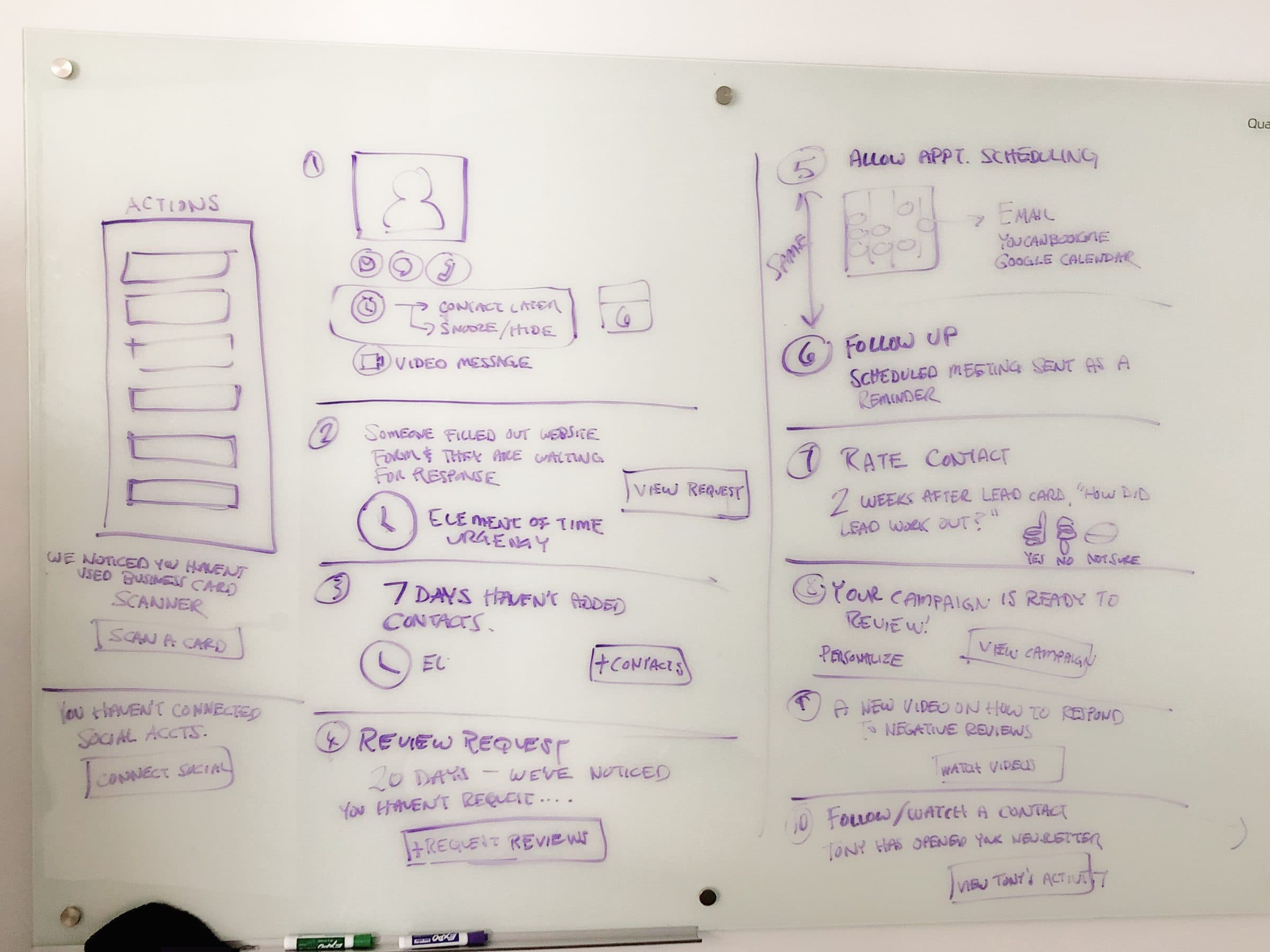
Ten candidate next steps. Number ten — 'Tony has opened your newsletter → view Tony's activity' — is the one the research kept pointing at.
A number gave them nothing. A name gave them everything.
The name is the handoff point: where the system's data ends and the agent's relationship knowledge picks up.
Round 1 replaced counts with names. Round 2 had to sort them.
By July 2021, more than 20% of users would see zero clicks by default, and more than half would see three or fewer. Even with names, the original sort still surfaced the weakest metric first.
Form fills, then clicks, then opens. If none of the signals existed, a fallback prompted contact-list growth instead of an empty state.
Always show the agent their best result first. The empty state was a missed next step, not a blank screen.
The highest-reach surface made the same swap first.
Every agent got the campaign digest whether or not they opened the app. The old one led with volume — emails sent, emails delivered — and buried the people under it. The new one opens on who to talk to and lets the counts close.
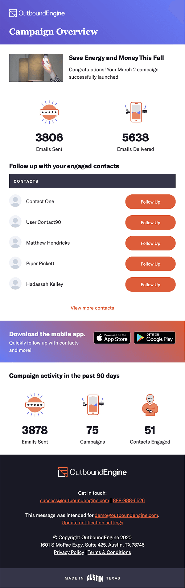
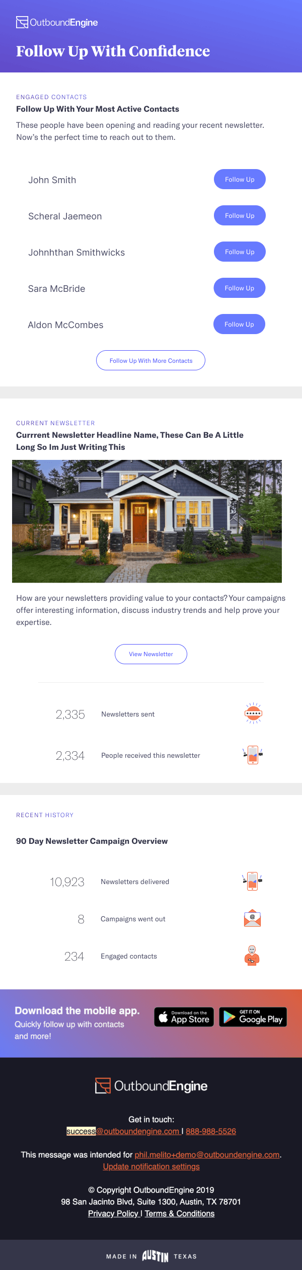
The web dashboard didn't get to inherit the answer. It had to earn it again.
An independent three-round research arc — a 30-customer survey, six stakeholder interviews, three prototyped dashboard concepts, then live interviews on working prototypes — landed on the same conclusion: contact-focused beat campaign-focused and segment-focused.
Sample 1 closed on contact-focused. The web surface had to prove the same insight the mobile work already had.
Contact-focused, Sample 1. Campaign-focused and segment-focused split the rest.
Same campaign. Different thing to do with it.
The mobile pattern translated to web through explicit data mappings. An agent who sees fourteen clicked has a number. An agent who sees a name on a home evaluation has a conversation to start.
What shipped
- Confirmed
- The paired study moved very-satisfied from 15.4% to 38.5%. An independent dashboard test preferred the contact-focused concept at 42.9%. NPS reached its highest recorded point in the period following rollout — directional only, not a causal claim.
- 15.4% → 38.5%Very satisfied on the paired-screen study
- 42.9%Contact-focused preference, dashboard closing test
- 13Customers in the paired-screen study
- 3Dashboard concepts tested independently on web
Instrument the email layer from launch.
Highest-reach surface, first thing that shipped, and we collected no behavioral data on how agents used it.
Role & credits
Pendo analytics, ideation, one generative research round, one follow-up survey, findings comms, UI design. PM: Ryan Pollack. SVP: Deepak Surana.